Problem
Users didn’t know how to interpret a report about how fees are charged to accounts overtime. On the kick-off meeting, the subject matter expert (SME) wanted me to use a timeline to help users visualize the process. This is the hand-sketched timeline:
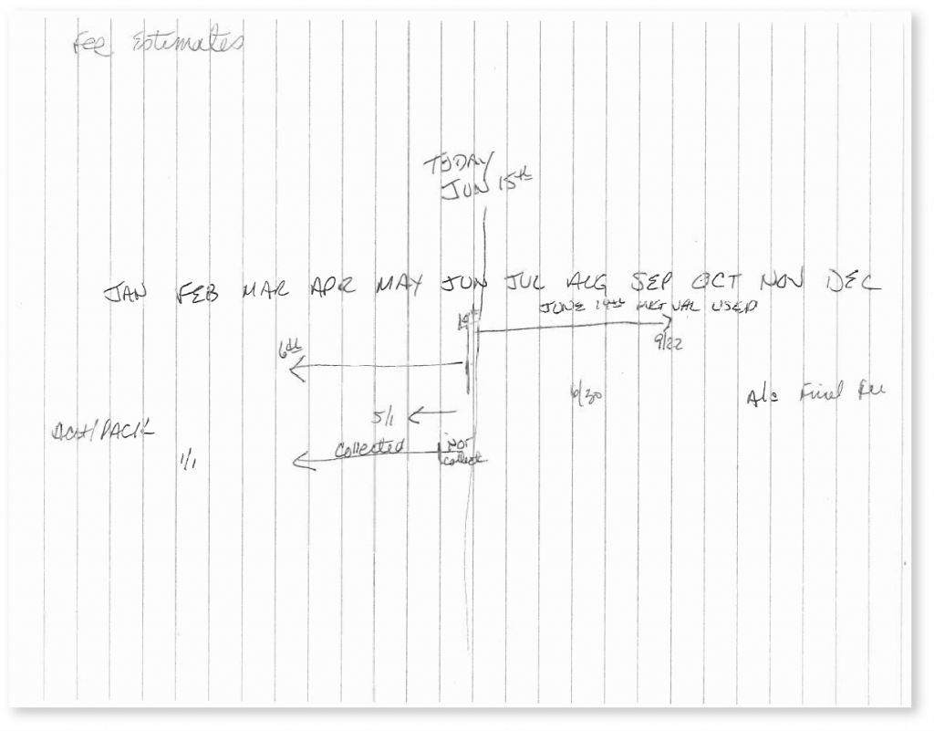
User participation process
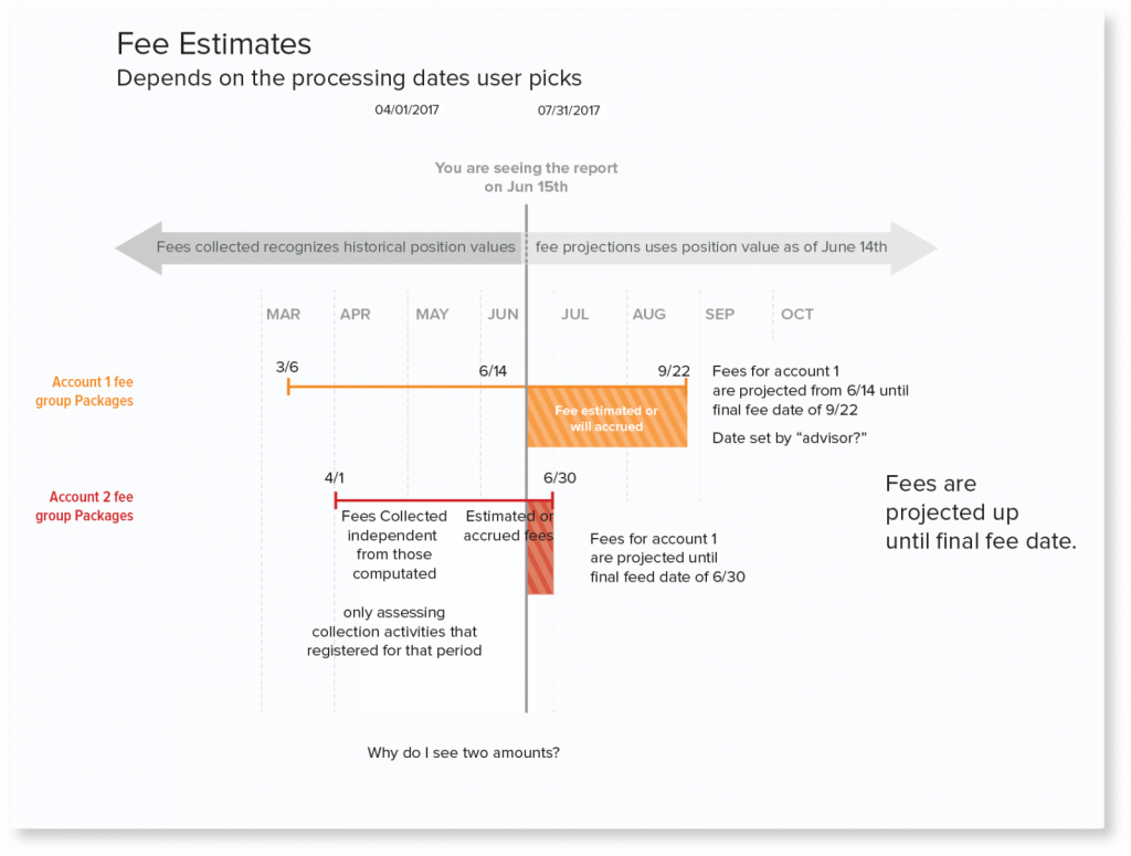
I was able to come up with a solution while working side-by-side with users and SMEs over a teleconference. During the sessions, I presented a polished up version of the sketch on my computer so I could make changes on the spot.
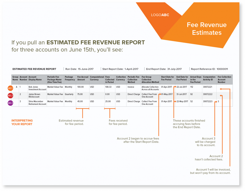
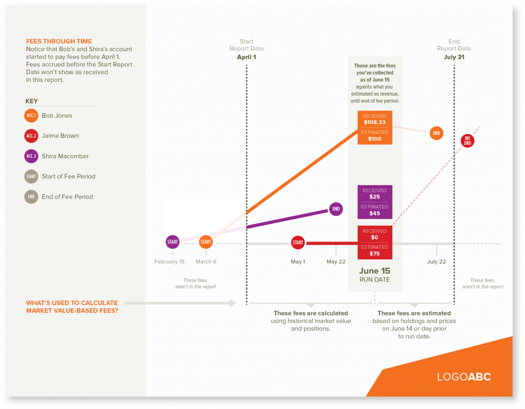
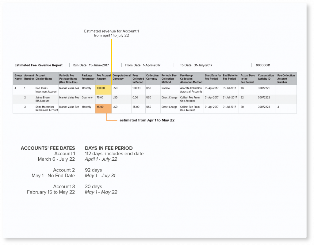
After the first session, I discovered that showing the timeline without the report wouldn’t give the data points enough context. I decided to add a screenshot of the report to the infographic. The other important discovery was that a linear timeline wasn’t effective at explaining how fee amounts change overtime. I switched to using a line chart to visualize the process.
Results
Final infographic shows a screenshot of the report on the first page to explain important columns. The second page is the line chart to visually represent fees through time.
