Background and challenge
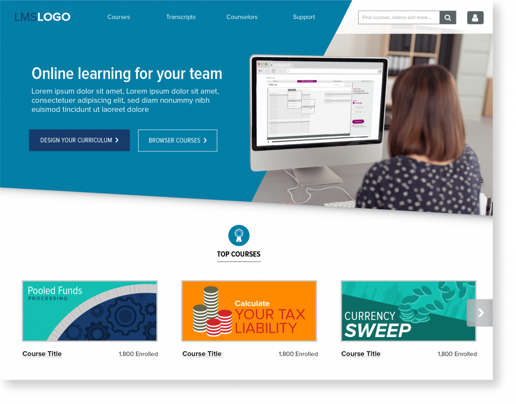
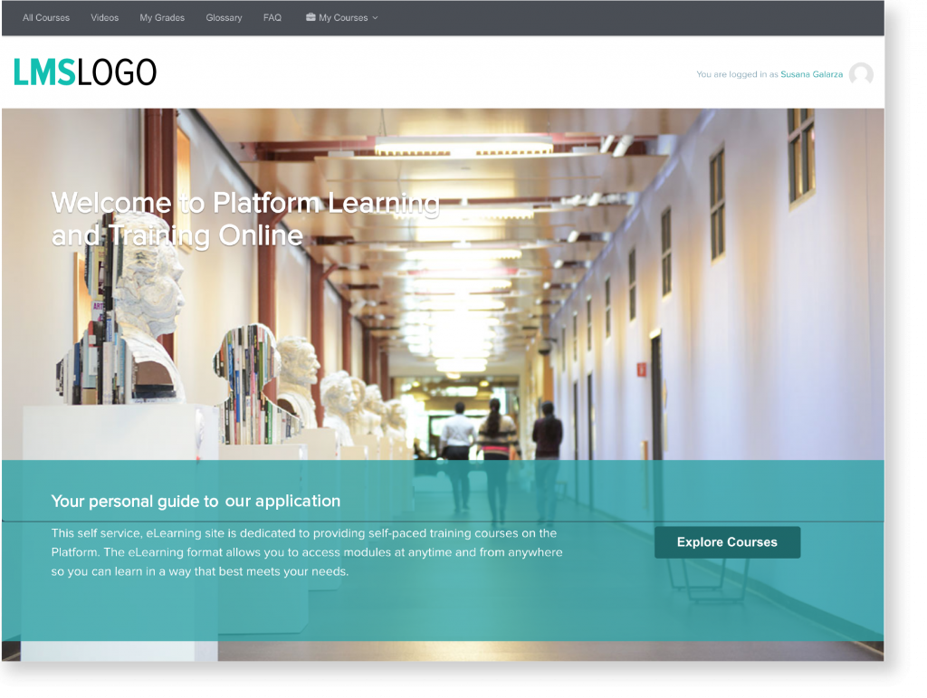
This organization offers online classes for new financial clients and employees through an online learning and training platform. Some of the platform’s main challenges were that the homepage didn’t have a search feature, the menu had unnecessary links, and its call to action was below the fold.
Stakeholder and user interviews
I spoke to stakeholders and users to find out what they wanted from the website and what tasks they need to accomplish. to identify their goals, pain points and how they use existing content.
Results of interviews
Goals:
- Improve call to action button label and location on the homepage.
- Add a search feature with real-time suggestions.
- Update the categories that online classes were organized under to reflect common industry terms.
- Restructure menu.
Interview quotes:
- “It’s overwhelming to see all these courses under ‘All Courses’” – user.
- “Let’s give users a self-serve tool” – stakeholder.
- “I’d like to see some sort of global search” – user.
Competitive analysis
I researched 15 online training platforms that catered to financial services companies to determine:
- Where search features were located.
- What information was featured on the homepage.
- How calls to action were labeled.
Wireframes
Below is one of the preliminary wireframes. The hero image shows an example of how users would interact with the courses.
