Background and challenge
I worked with a team of instructional designers and writers to create online classes to educate employees how to use financial applications. We were not getting useful feedback from clients to improve our classes so I decided to conduct a usability testing.
These were our three objectives:
- Find out if the interface is easy to use.
- When writing steps for audio instructions, determine what is the right amount of information to present.
- Discover users’ pain points and what works for them.
Usability Testing
I lead the planning, writing, and design of an in-person, moderated usability testing. I worked with two other team members and used this opportunity to train them on how to conduct user interviews.
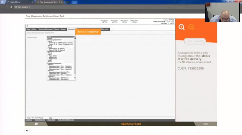
Each participant went through four activities and they could take them in any order. Since I wanted to test ease-of-use, instead of comprehension of financial terms, I chose novice users.
We uploaded high-fidelity prototypes to a demo site that mimicked the real online courses. Each session was recorded to capture facial expression and mouse movements.
Effort/Impact Matrix
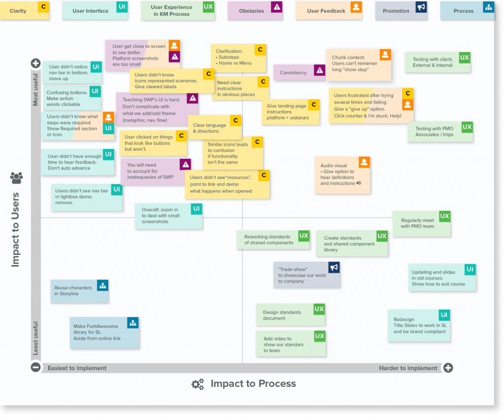
We compiled quotes and timestamps from each session to highlight pain points and opportunities. We presented the study findings to the rest of the team and managers. During the workshop, we wrote our observations in stickies and organized them on an effort/impact matrix.
Some key findings were:
- Ease-of-use: there was a lack of clarity in instructions, some instructions were too long to remember, and there were confusing interfaces.
- Engagement and interactivity: users said they learned better when they had to perform a task to learn a process, as opposed to watching a video. One users referred to an instructional video as a “snoozer”.
- Pain points: screenshots had text that was too small to read.
Affinity Diagram
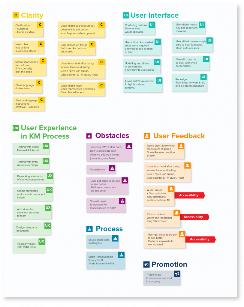
I organized the stickies by category to find patterns. This would help us define priorities, plan future sprints, and assign responsibility.
Results
Here are some of our new user experience design standards:
- Minimum size for text on screen is 18 pt (Articulate Storyline size).
- Explain a maximum of 3 fields per step to avoid taxing users and overload them with information
- Don’t auto-advance users. Include necessary controls such as seek bars, buttons, and links.
- Write natural labels in interfaces. For example, instead of naming a button “continue”, relabel to “buy stock”.
- Screenshots, used to explain financial application functionality, must be captured at 110%-125% from their original size.
