Background and challenge
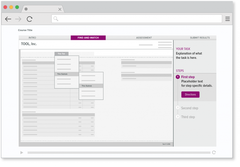
This organization uses an online training platform to educate employees. The challenge was that students in an online training class didn’t know how, or where, to get help while completing learning activities. My team and I improved an existing “Help” button.
Concept testing
We spoke to six users regarding what action they would take if they needed help. I made hi-fidelity, screen-based mockups and wrote a script to make sure our language was consistent, conversational and non-leading.
Findings
We made two major discoveries during concept testing:
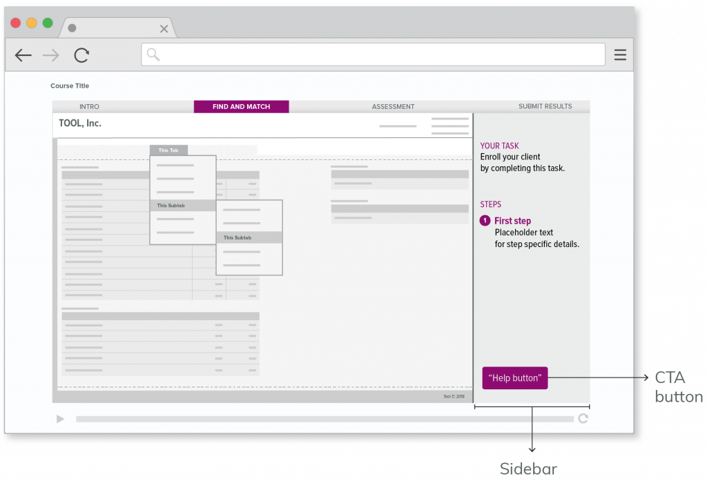
- Users didn’t see the call to action button when it was located at the bottom of the sidebar.
- Users wanted to see the complete number of steps within a learning activity. We added future steps, (steps 2 and 3 in this specific example) to a timeline view.

Results and visual design
Based on user feedback obtained during concept testing, the location of the call to action was improved and the button was re-labeled “Directions”.
